Archive for January, 2009

Deco Aluminum Chairs In A 1953 Rail Lounge Car Restoration

Saturday, January 31st, 2009

Photo Courtesy Ben Butterworth

Photo Courtesy Ben Butterworth

First class business travel in the era of cigars, cigarettes, three-piece suits, white shirts and narrow ties took place aboard Santa Fe’s renowned El Capitan and Chief streamlined passenger trains. The Mohave Lounge Car was originally built in 1953 by the Budd Company a leading manufacturer of stainless steel streamlined passenger rolling stock for a number of railroads.

After twenty years of service on the Santa Fe and another twenty years for Amtrak the Mohave Lounge Budd railcar was purchased by Mid America Railcar Leasing. The Mohave Lounge Car underwent an extensive rebuilding that combined the newest railroad systems and safety  technologies with the distinctive Santa Fe ambiance of the railroad’s great Streamlined period.

Included in the interior restoration of this vintage railcar was an upholstered version of the distinctive Deco Aluminum restaurant chair. The Deco style, small scale, light weight and durable construction of this aluminum chair made it the perfect choice for everyday use aboard the Mohave Lounge.

DecoDina Aluminum Chair www.kpetersen.com

DecoDina Aluminum Chair www.kpetersen.com

Who’s Going To Clean That?

Sunday, January 25th, 2009

Eating a meal in a restaurant is a great convenience. Usually the customer is able to select exactly what they are hungry for at a price that is reasonable or at least what they expect to pay. The added value for many restaurant patrons is that there is no going to the store to buy ingredients, no preparation, no cooking and best of all no dirty dishes or other clean up chores to do when the meal is finished. No clean up is one of the many reasons why there is no such thing as a free lunch!

Most of the heavy cleaning a restaurant needs to do is done after hours.  The quick clean ups between customers does take some time though and is necessary to maintain an establishment’s reputation.  A restaurant’s famous croutons, crunchy appetizers, tortilla chips or french bread are better anticipated than seen all over the furniture from the last customer’s meal.

Try to choose restaurant chairs, booths and bar stools with quick cleaning in mind.

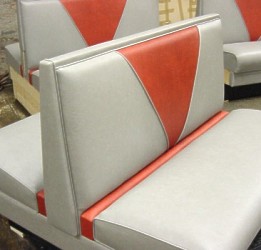
Restaurant Booth with a Crumb Rail

Restaurant Booth with a Crumb Rail

Restaurant booth manufacturers usually offer a  Crumb Rail option for most booth styles.

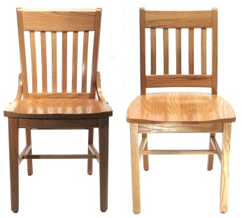
Some popular restaurant chair styles are easier to keep clean than others.

Two Wood Restaurant Chair Styles

Two Wood Restaurant Chair Styles

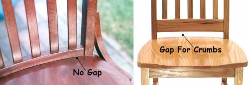
Chairs with and without clean out gaps

Chairs with and without clean out gaps

Restaurant furniture durability, looks and comfort are important. The way restaurant furniture products work are important too and can add or subtract from your restaurant’s reputation and profitability.

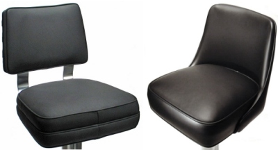
Counter Stool Seats

Counter Stool Seats

Formica Brand Boomerang Plastic Laminates

Saturday, January 24th, 2009

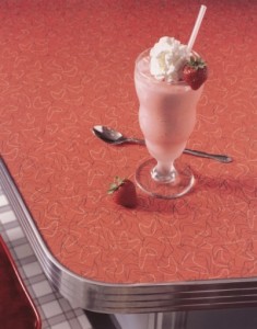
Formica Boomerang plastic laminates are the most fun you can have with your restaurant dining room budget.
Formica re-introduced their Boomerang Plastic Laminate patterns a few years ago.  Now priced like any standard pattern you can use Formica Boomerang laminates even on a budget. The curvy, colored boomerangs are the restaurant designer’s antidote for today’s gloom and doom.

Formica Boomerang Aqua #6959

Formica Boomerang Aqua #6959

Formica Boomerang Charcoal #6942

Formica Boomerang Charcoal #6942

Formica Boomerang Coral #6941

Formica Boomerang Coral #6941

Formica Boomerang Skylark #6940

Formica Boomerang Skylark #6940

Formica Boomerang Restaurant Table

Formica Boomerang Restaurant Table

Often used on table tops and counters, Formica Boomerang laminates can also be used imaginatively on restaurant cabinets, laminated plastic booth seats and fast food waste receptacles.

Visit Formica Brand Plastic Laminates Web Site www.formica.com

COLOR In Restaurant Interior Design

Sunday, January 18th, 2009

Familiarity with color psychology, use and theory will help you achieve a total color effect.
Refer to the summary below for some guidance in the selection of restaurant interior surface finish colors.

Light and Cool Colors Recede
Light and cool colors can make a small space seem bigger.

Dark and Warm Colors Advance
Dark and warm colors can be used in large rooms to keep the space from feeling vast.

Bold, Primary Colors = Speed
Primary colors are appropriate for encouraging fast food turnover and in children’s areas.

Subtle Colors are Restful
Pastels can make a room feel bigger and often have a calming, peaceful effect.

Color Can Convey a Style
Color can evoke a theme or style: For example, Green for nature, pastels for Post- Modernism, red, black & white for a 1950’s diner look or gray & pink combinations for a 1930’s, 1940’s Art Deco Look.

Colors Should Relate to Climate
Warm colors feel right in colder climate restaurants, cool colors feel right in warmer climate restaurants.

Think about the feelings colors convey
and what colors can do and say.

RED
Red suggests aggression, hostility, heat, stop, error, warning, danger, error, fire, lushness and passion. Red & black is a classic restaurant combination.
Some say red enhances the appetite.

GREEN
Associated with nature the pastoral and general well-being. Green also suggests envy and jealousy. Green should not be overused. Too much can affect skin tones and the appearance of some foods.

YELLOW
Yellow suggests the sun, expansiveness, happiness and high spirits. Yellow commands attention and suggests caution. It can be used successfully as a highlight.

BLUE
Blue suggests the peaceful, the sad and water. Blue is often associated with the male.
Blue is a cool color and can visually expand a room. It does not compliment most foods. Blue goes well with warm colors and materials.

BLACK
Black can have negative sociological connotations. However, black can be very stylish and and modern. Black works well as an accent with other colors.

WHITE
White suggests the virginal, the cold and the clean (think table linen).
White walls can encourage turnover and are in keeping with the bright, clean atmosphere of a fast food environment. Too much white can cause glare.

NEUTRALS
Dark browns suggest masculinity, lighter browns warmth and femininity. A neutral background allows for flexibility.

These are not “colors” but are used as such in restaurant surface decoration and products

GOLD/BRASS
Gold and brass have a warming influence and can help offset cold materials like stone or brighten dark materials like dark wood.

CHROME/STAINLESS STEEL
Chrome and stainless steel are neutral, cold, hard and clean. Polished chrome surfaces can add color and movement by reflection. Chrome and stainless steel suggest the modern style as well as antique styles like Art Deco, 1940’s and 1950’s restaurant interiors.
Basic restaurant interior design guidelines and still more things for you to think about….

Sunday, January 18th, 2009
  • Dining Room
    Because this is the restaurant’s revenue producing area it takes up the largest amount of the total space. For restaurants with greeting or waiting areas…this area, by necessity, is usually near the entry but it should be far enough away from the door and large enough so that waiting customers do not block traffic entering and leaving the restaurant. Back ups in the waiting area can make the restaurant appear to be more crowded than it really may be. Waiting areas should be comfortable but not so much so that it becomes difficult to move customers to their tables.
    * See Upholstered Waiting Benches
    * See Laminated Plastic Waiting Benches

    Rooms with a regular layout of tables and booths neatly lined up in rows seem formal. Tables that are randomly spaced throughout the room with different sizes and types of seating mixed in lead to a feeling of informality and creates a visually interesting restaurant. Having the right combination of sizes of tables in a restaurant can decrease wait time for customers and can maximize seating capacity and profit.

    People tend to be attracted to curved forms. Asymmetrical booths, bars, counters and table shapes encourage interaction between guests with face to face seating. However, curved walls as well as any space dividers should be well thought out so as to create a sense of larger space…the fewer restrictions to movement the larger the space feels.
    * See Undulating form restaurant booth

    Spatial arrangements should always be orderly, guiding people in logical progression from area to area.
    The layout of the dining room and the furnishings control how efficiently the restaurant dining room operates. How smoothly things run affects the customer’s experience and a future decision to return. Fast and professional service requires efficient traffic flow in a restaurant.

  • Interior Design, Decor, Furnishings
    The customer views the restaurant’s appearance as part of the value equation that determines where he decides to go and whether or not he will return for other visits.

    It is important to identify the cultural and/or ethnic background of the target market.
    Is the target market urban, suburban or rural? Will the customer prefer wide open spaces or a crowded, cozy atmosphere?

    Depending on your type of business you will want your customers to stay for different lengths of time.
    In fast food dining rooms primary colors and bright lighting can be used to emphasize identity and to create an upbeat, high energy image. Some degree of uncomfortable tactile experiences like smooth, hard surfaces can be appropriate for fast food too. These elements also facilitate turnover and easy maintenance. However, in a fine dining establishment or where liquor is served the comfort of your seating must correspond with the length of time you want your customers to stay.

  • Menu
    The cost of the meal carries with it expectations about the overall dining experience including a room’s appearance and comfort. Conversely, the overall appearance of the restaurant can help support the menu prices.

Restaurant Tables What Size Do You Need? #3

Friday, January 16th, 2009

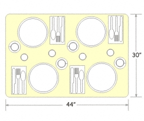
30" X 44" Restaurant Table

30" X 44" Restaurant Table

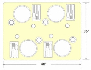
The architectural standard for dining suggests that 300 square inches be allowed per diner.
The table above would be an appropriate size for fast food food restaurants, cafe and coffee shop dining.
30″ X 44″ = 1320 Square inches. Divide that number by the suggested 300 square inches
per diner and you arrive at more than adequate table space for four persons.
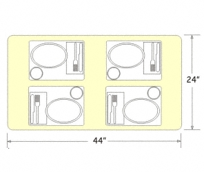
The table below still seats four however, the 24″ X 44″ table top size yields only 264 Square inches of space per person
suggesting that this size table would be appropriate only for fast food restaurants or the most basic, quick-serve coffee shop, diner,
employee lunchroom or the like.

24" X 44" Restaurant Table

24" X 44" Restaurant Table

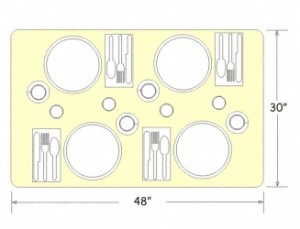
Some menus require larger than the recommended minimum 300 square inches per diner.
Fine dining restaurants, Pizza restaurants, Mexican restaurants and many Asian style restaurants require more table space for utensils, condiments, serving
platters and other serving style equipment.
Some food service operations, like hospital cafeterias and school cafeterias use trays.
The primary considerations for determining the table top size you need is WHAT you are serving your customers and HOW you are serving them.
If you have space limitations, consider placing fewer tables in the room rather than creating an unpleasant experience for your customers and
additional problems for your wait staff.

30" X 48" Restaurant Table

30" X 48" Restaurant Table

36" X 48" Restaurant Table

36" X 48" Restaurant Table

(more…)

Restaurant Tables What Size Do You Need? #2

Thursday, January 15th, 2009

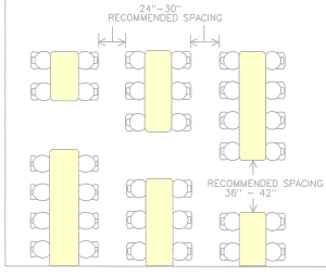
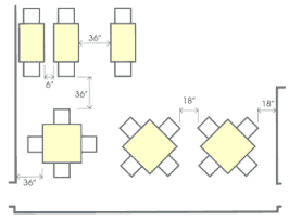
Recommended Table Spacing

Recommended Table Spacing

Recommended Table Spacing

Recommended Table Spacing

Room size, shape and function determine the layout of tables in a room. For table spacing in public places always refer to local codes for restrictions and safety requirements. The drawings above and below offer some general, customary aisle allowances. For a comfortable and pleasant dining experience there can never be too much room.

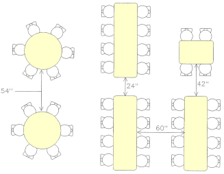
Recommended Banquet Table Spacing

Recommended Banquet Table Spacing

For banquet room and cafeteria lunchroom seating allow a minimum of 54″ between round tables and 60″ between rectangular tables for chair and 24″ service space. Main traffic aisles need to be larger.

Restaurant Tables What Size Do You Need? #1

Thursday, January 15th, 2009

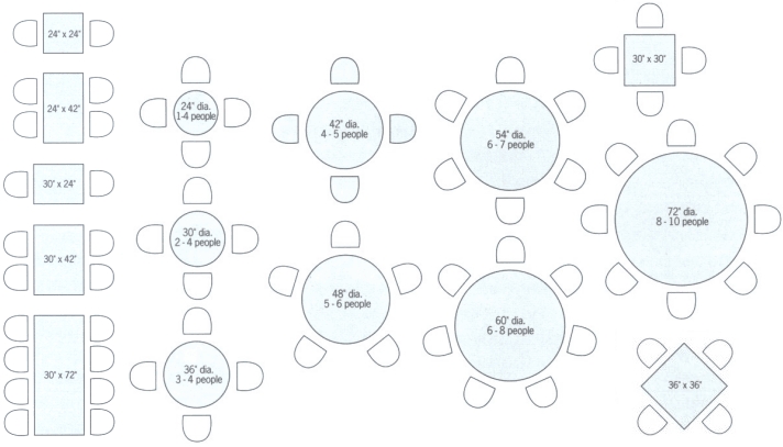
The drawing below offers some basic guidelines for restaurant and cafeteria table capacities.


Seating capacities are based on standard chair sizes.

If large, swiveling or castered chairs are used, adjust accordingly.

Restaurant Table Layout Drawings (Click Image To Enlarge)

Restaurant Table Layout Drawings (Click Image To Enlarge)

Having the right combination of sizes of tables in a restaurant can decrease wait time for customers and can maximize seating capacity and profit.
Use small tables in small restaurants and then combine them to accommodate larger parties. Be aware that combining tables may cause some temporary seating capacity loss (e.g. two 4-person tables combined to seat only six customers).

Try to avoid using large dedicated tables (eight-person or larger) in small restaurants. This will help to save space and seating capacity.

Using some large seating capacity tables in larger restaurants creates “special” areas. Using a few large tables also helps to break up the space and enhances overall ambiance and reduces customer discomfort caused by crowding many small tables into a large space. In larger restaurants there will often be sufficient numbers of large parties to offset the seating capacity loss caused by large size restaurant tables.

Restaurant Booths Space Requirements # 1

Sunday, January 11th, 2009

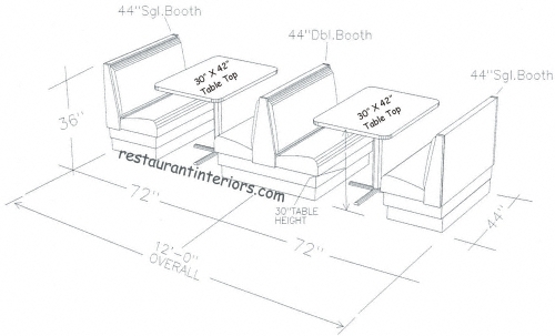
The standard, customary “booth opening” size (the amount of space required for each complete booth arrangement of seats and table top) is usually 72″.

Restaurant Booths Space Requirement

Restaurant Booths Space Requirement

However, restaurant booth space requirements are largely determined by the width of the table top. For example, if your restaurant’s menu and food service style ( like pizza, Asian or Mexican food) require more than a standard 30″ wide table top you may need to plan for more booth opening space.  Conversely, if yours is a fast food establishment, coffee shop or an employee breakroom a narrower table top width (like 24″) will result in a space savings of 6″ per booth opening compared to using a 30″ wide top.

You can view more drawings and general restaurant booth layout dimensions at our main web site.